Quercus Data Insights provides a powerful tool to monitor and analyze student activity on Quercus, allowing instructors to gain insights into their students’ aggregated activity with course elements.
This dashboard is organized into pages with visualizations that display different aspects of student activity. Each page can be filtered by course, section, date, course element type (i.e., Announcements, Assignments, Discussions, External Tools, Files, Pages, Quizzes and URLs), or course element name (i.e., each individual item).
Description of the Dashboard Pages
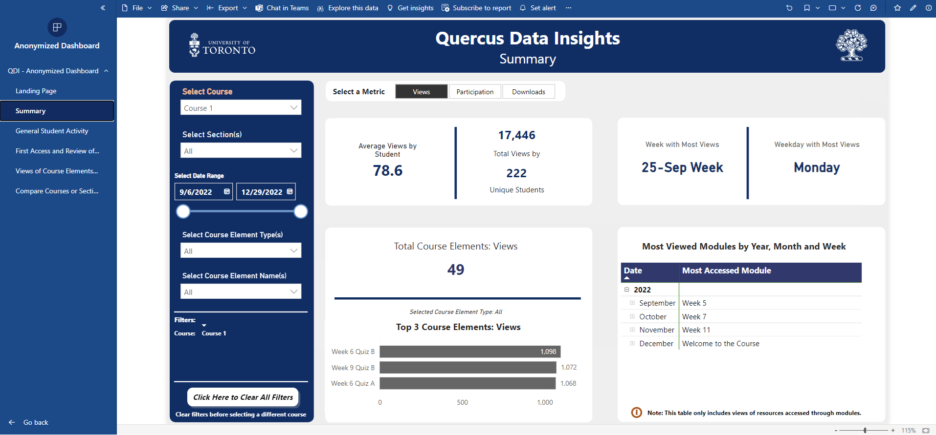
Summary: An overview of key metrics from other dashboard pages in the form of easy-to-read cards. It provides a summary of student activity while also allowing for comparisons between different metrics on the same page.
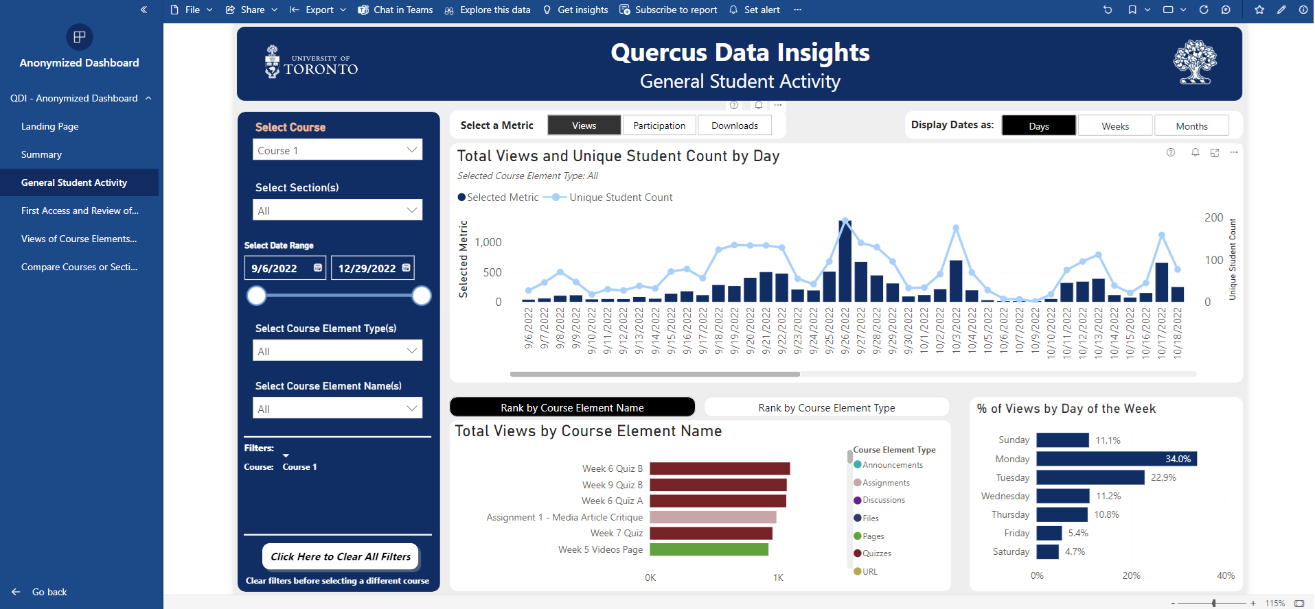
General Student Activity: Provides an overview of the activity metrics (i.e., views, participation or downloads) throughout the course’s term. This page contains three visualizations showing: a) student activity and unique student counts by day, week and month; b) course element name and type ranked by activity; and c) the percentage of activity for each day of the week.
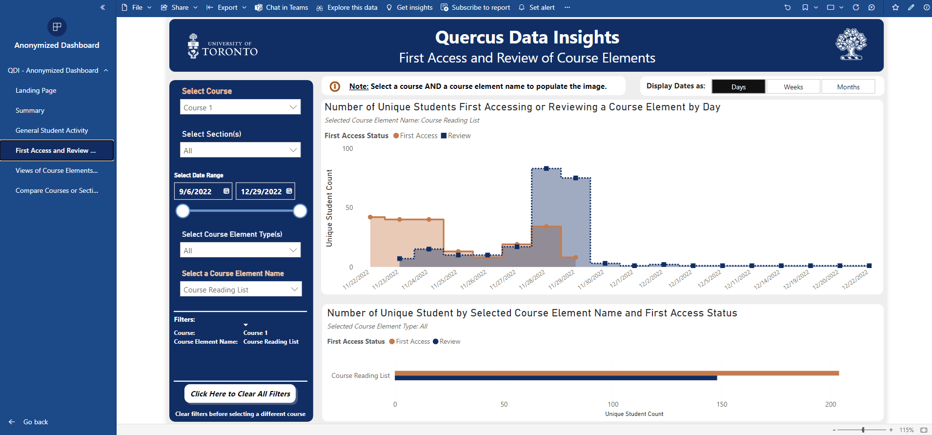
First Access and Review of Course Elements: Provides insights into first and later access to a course element. The first visualization on this page displays the daily or weekly number of students accessing a selected course element, both for the first time and when reviewing it. The second visualization shows the number of unique students first accessing and reviewing the course element.
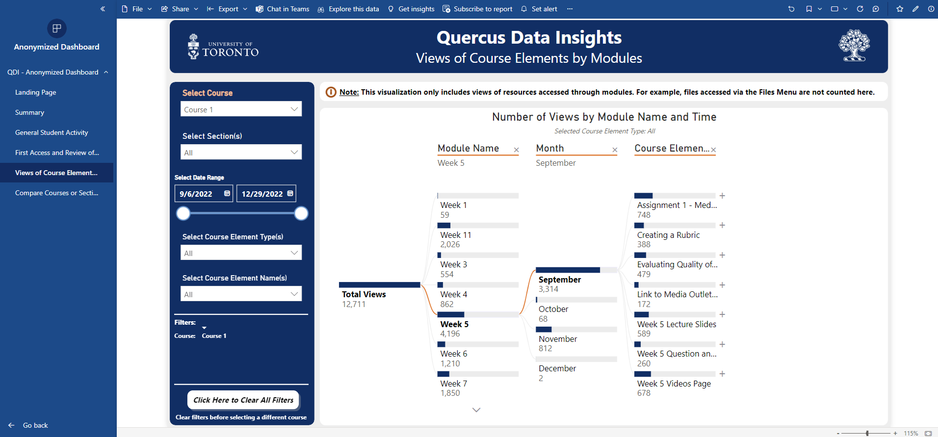
Views of Resources by Modules: Provides insights into student views of items inside each module. The visualization on this page can be expanded into pre-selected categories to give more detail about the number of views. Instructors can click on a bar to expand or collapse a category, as well as re-organize the categories by clicking on the “X” to remove a level and the “+” to add a level.
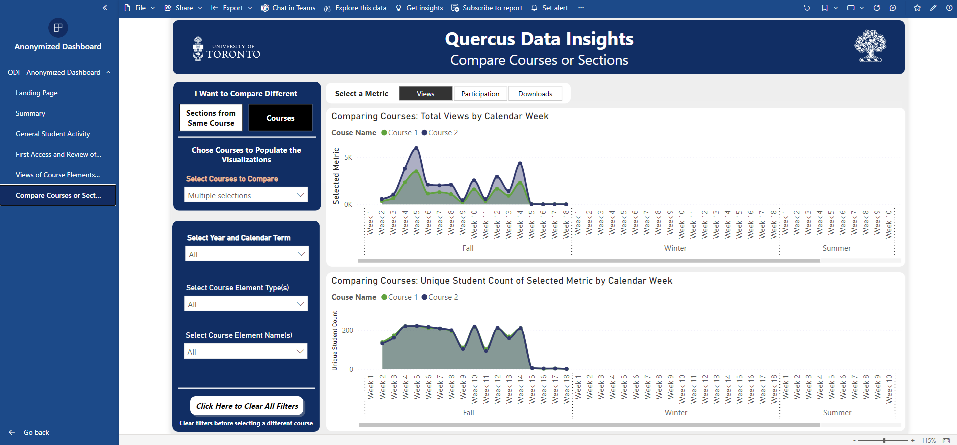
Compare Courses or Sections: Provides a comparison of multiple courses or sections in the same visualization. The first visualization displays student activity by week for the selected courses or sections. The second visualization displays the counts of students engaging in the activity for the selected courses or sections.
Note: The current version of the dashboard presents aggregated visualizations for all students. It does not include reports on student performance in assessments, does not provide reports about individual students, and does not have an option to download the raw data.
Instructors can find information about additional analytics resources by visiting the “Deeper into Data and SoTL” page, including guides on how to download activity reports from Quercus, access Quercus New Analytics, apply for REB (Research Ethics Board) approval, and participate in CTSI (Centre for Teaching Support and Innovation) program activities.